Mobile App Design Dubai:
UI UX for Digital Success
In Dubai’s competitive mobile app market, success hinges on exceptional user interaction, defined by UI (User Interface) and UX (User Experience) design.
UI focuses on the visual and interactive elements users see and touch, colors, typography, graphics, translating brand identity into an engaging, tactile experience.
It uses visual cues to guide users and make elements intuitive. UX, conversely, is the strategic blueprint for user satisfaction, making an app intuitive, easy to use, and accessible. It defines the app’s structure and logic to meet user needs with minimal cognitive load, ensuring a logical and efficient user journey from concept to code.
Strategic Growth Policy
Mobile App Design Process | UX UI Workflow for Dubai Apps
A successful app development process in Dubai follows a structured, sequential workflow to mitigate risks and ensure both beauty and functionality. Premature UI focus without a solid UX foundation leads to failure.
- Personas: Design begins with understanding end-users. Fictional, research-based personas detail needs, goals, behaviors, and pain points (e.g., separate personas for a “driver” vs. “passenger” in a ride-sharing app).
- User Flows: Mapping the user’s journey to complete tasks, identifying every screen and action needed, exposes logical gaps before visual design.
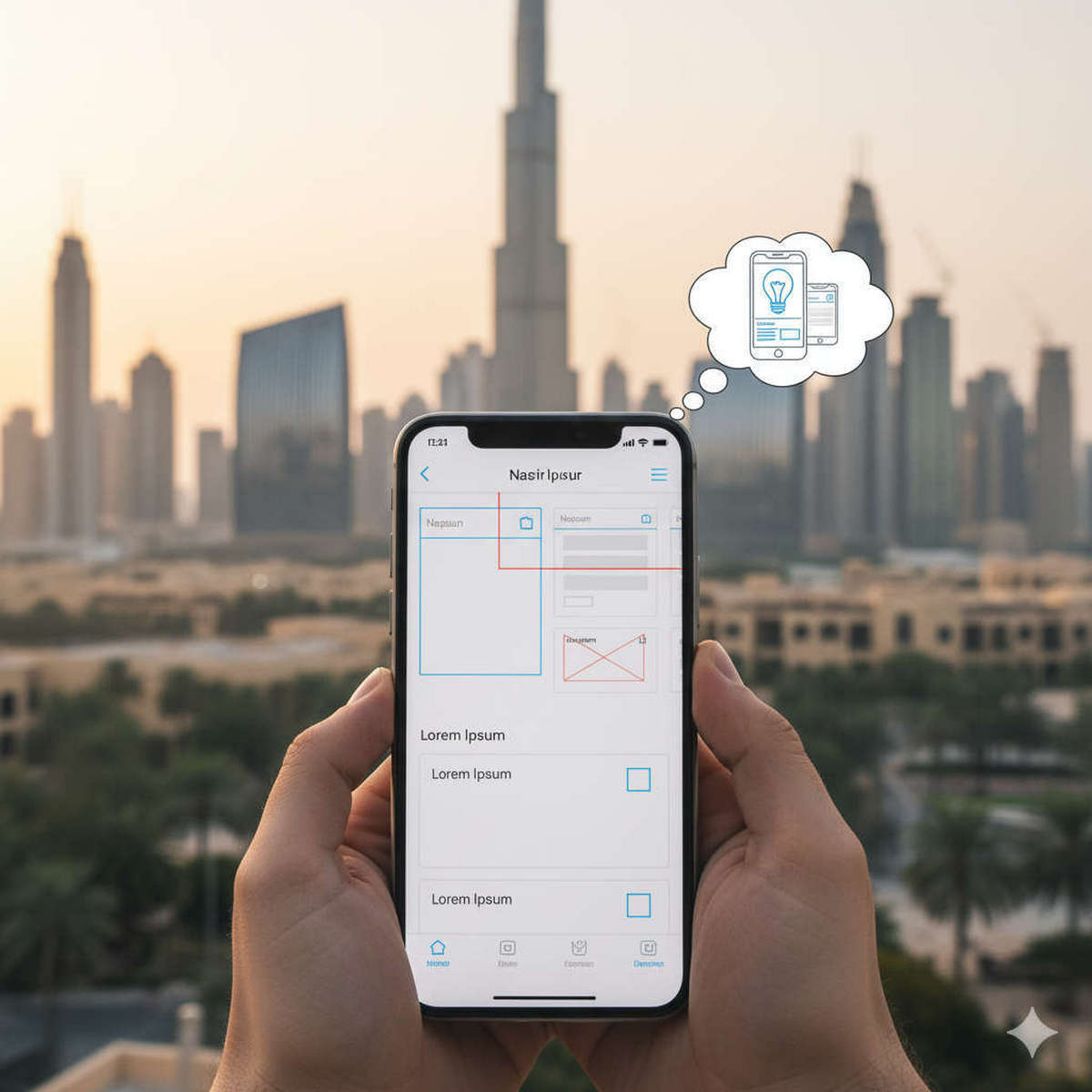
- Wireframes: Low-fidelity schematics focusing on structure, content placement, and functionality (greyscale blueprints). Essential for validating layout and interaction.
- Mockups: High-fidelity, static representations applying full UI design (colors, typography, branding) to wireframes, serving as the final visual specification for developers.
Intuitive Mobile App Design | UI Principles for Dubai Apps
Effective mobile app design in Dubai adheres to universal principles, strategically responding to mobile constraints like limited screen space and touch input. These principles manage cognitive load and create effortless experiences:
- Simplicity & Clarity: “Less is more” on small screens. Minimize clutter, limit choices, and ensure every step is essential. A clean interface reduces cognitive load.
- Consistency: Uniformity in visuals (colors, fonts) and interaction patterns (gestures, buttons) builds familiarity and trust, reducing the learning curve, crucial for busy users in Dubai.
- Visual Hierarchy & Readability: Guide user attention with size, color, contrast, and placement. Ensure sufficient text contrast and optimized font sizes for legibility on small screens and in bright light.
- Feedback & Responsiveness: Provide immediate confirmation for every user action (visual, auditory, haptic) to prevent frustration and ensure input is registered successfully.
- Designing for Thumbs: Place primary actions and navigation (e.g., bottom tab bar) within the “thumb zone” for comfortable, one-handed use. Ensure large, adequately spaced tap targets to prevent mistaps.
Mobile App UI Components | Essential Elements for UAE Design
Mobile app interfaces are built from standardized UI components, forming a universal interaction language. Leveraging these established patterns ensures an intuitive, familiar experience for users in Dubai:
- Input Controls: Buttons (primary/secondary), checkboxes, radio buttons, toggles, sliders, and text fields allow users to enter information and make selections.
- Navigational Components: Tab bars (bottom navigation), navigation drawers (hamburger menus), search bars, and breadcrumbs guide users through the app’s various sections and screens.
- Informational Components: Icons, tooltips, progress bars, loaders, modals, and alerts provide context, feedback, and system status updates.
- Containers: Cards and accordions group and organize related content, presenting complex information in a digestible, scannable format.
iOS vs Android UI Design | Native Apps for Dubai Users
While universal design principles apply, iOS (Human Interface Guidelines – HIG) and Android (Material Design) have distinct design systems, rooted in different philosophies and ecosystems. A “one-size-fits-all” approach often fails in Dubai’s diverse market.
- Core Philosophies: iOS HIG champions clarity, deference to content, and depth with a flat aesthetic. Android Material Design uses a physical metaphor with elevation and realistic shadows for hierarchy.
- Navigation: iOS prefers a bottom Tab Bar for primary navigation; Android offers flexibility with Bottom Nav Bar, Tabs, or Navigation Drawer, alongside a system-level back function.
- Aesthetics & Controls: Differences are pronounced in elevation, typography (iOS SF, Android Roboto), button styles (iOS flat, Android raised with FAB), and alerts/pickers (iOS scrolling wheels, Android calendar view).
- Accessibility (a11y): Designing for all users, regardless of ability, is crucial. This includes screen reader support (alt text), sufficient color contrast, dynamic text sizing, large touchable areas, clear focus states, and multiple cues for information. Accessibility ensures a robust product for all users in Dubai.